Start Here
Outside Zone is currently free and there is more on the site than anyone is going to work through in one sitting. This is where to start.
Highlighting these four tools will give an insight into the types of data we have. For each one: the question it answers, what is actually inside it, and a concrete thing to go try.
A note on the numbers before any of it. Everything here comes from play-by-play data, computed once and stored, rather than recalculated in your browser every time you load a page. That is why the tools are fast, and it is also why a player’s numbers agree with each other across tools. The same EPA that shows up on a single play in Play Explorer is the one aggregating into that player’s route table in Player Lookup.
Play Explorer
The question it answers: what actually happened on this play, beyond the result?
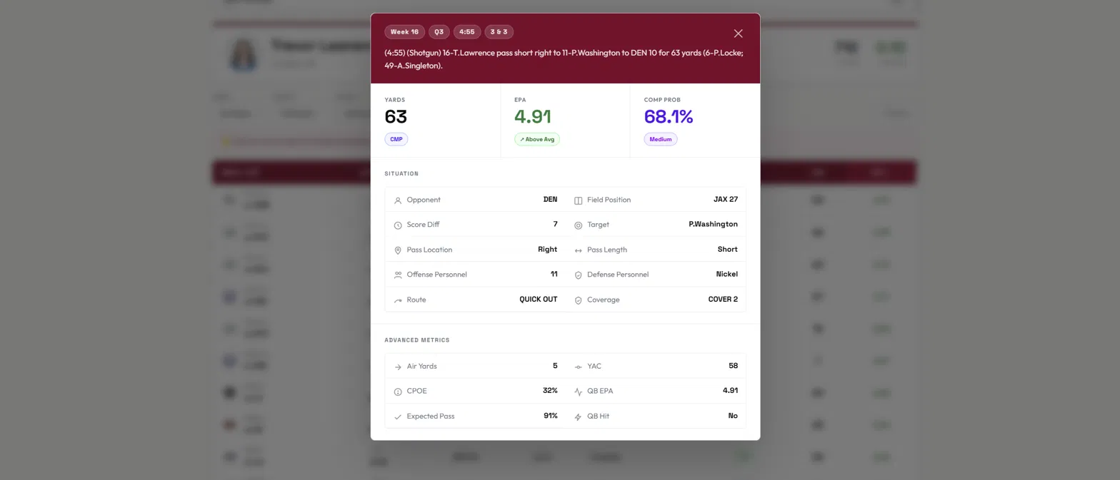
A box score tells you a completion went for 63 yards. That single number is doing a lot of hiding.
Here is that play. Third and three, Q3, out of shotgun. The throw was a quick out to the right against Cover 2 with nickel personnel on the field. The ball traveled 5 yards in the air. The receiver produced the other 58 himself.
So the 63 yards belong almost entirely to the receiver, not the throw. Nothing in a standard box score would ever tell you that, and it changes how you credit the play completely.
The other numbers on that card are worth understanding, because they show up everywhere else on the site:
EPA is expected points added. Every situation on the field has an expected point value based on down, distance and field position. EPA is the change in that value from the snap to the end of the play. A play worth 4.91 EPA moved the offense nearly five expected points closer to scoring. It is the single best measure of whether a play helped, because it accounts for context that yardage ignores. Three yards on third and two is a good play. Three yards on third and eight is not. Yardage cannot tell those apart. EPA can.
Completion probability is a model estimate of how likely that throw was to be completed, given depth, location, pressure and coverage. This one was 68.1%, which is a moderately difficult throw.
CPOE is completion percentage over expected. It is the gap between what happened and what the model expected. A completed pass with a 68.1% completion probability produces a CPOE of about 32%, because the quarterback delivered 100% where 68.1% was expected. Across a full season, CPOE is one of the more stable measures of quarterback accuracy, because it does not punish a quarterback for attempting hard throws.
Air yards and YAC split a completion into the part the quarterback produced and the part the receiver produced. This is the split that made the play above interesting.
What to go try: filter to third and long, then read the plays rather than the summary. You will notice quickly that the highest-EPA conversions are frequently short throws where a receiver did the work, not the downfield shots that get remembered. Play Explorer is at its best when you use it to check something you think you already know.
Player Lookup
The question it answers: what is this player actually good at?
The Player Lookup tool is the best way to find in-depth statistics for a unqiue player. Whether you are looking for a certain running backs yards per carry out of 12 personnel or a tight ends catch percentage on deep balls, find it here.
Season totals flatten everything. A receiver with 1,700 yards looks identical on paper whether he earned them on slants or on posts, and those are completely different players with completely different values to an offense.
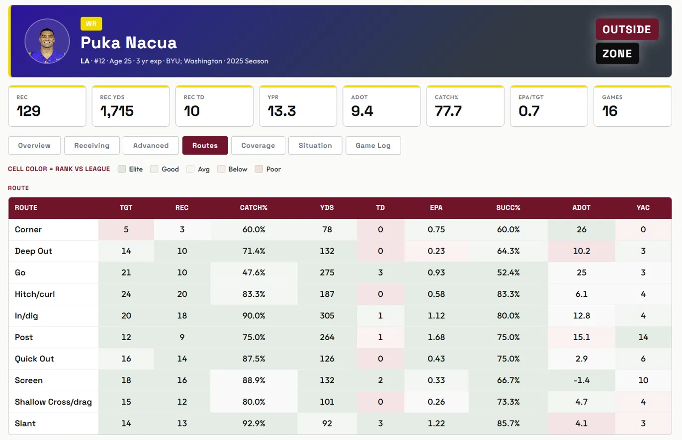
The Routes tab breaks a receiver’s season out by concept. Targets, receptions, catch rate, yards, touchdowns, EPA, success rate, average depth of target and YAC, on every route he ran.
Look at what that reveals about Puka Nacua’s 2025. On posts, 12 targets produced 1.68 EPA per play. On screens, 18 targets produced 0.33. That is a five-fold difference in value per play inside the same season, for the same player.
But the table does not tell you to stop throwing him screens, and this is where the tool rewards a careful reader. The screens converted at 88.9% and produced two touchdowns. They are a different tool for a different job: low variance, high floor, useful on early downs. The posts are the explosive play. An offense needs both. What the table gives you is the ability to see which is which, instead of averaging them into one meaningless season line.
The slant row is the one I would point at. Thirteen catches on 14 targets, 92.9% catch rate, 85.7% success rate, three touchdowns, on an average depth of 4.1 yards. That is a route being run at near-perfect efficiency, and it is completely invisible in a season stat line.
Success rate is worth defining, since it appears across the whole site. A play is successful if it gains enough yardage to keep the offense on schedule: roughly 40% of the distance needed on first down, 60% on second, and everything needed on third or fourth. It is a consistency measure rather than a big-play measure. A receiver can post strong EPA on a few explosive plays while posting a poor success rate, and that tells you something real about how he is used.
aDOT is average depth of target, or how far downfield the ball is thrown to him. It is the fastest way to understand a receiver’s role. A low aDOT with high YAC is a player being used near the line and asked to create. A high aDOT with low catch rate is a player being asked to win contested downfield.
Every cell is colored by where it ranks against the rest of the league, so you can scan the table and read the shape of a player before reading a single number.
What to go try: open a receiver you think you know well and find the gap between his two best routes and his two worst. That gap is usually the most interesting thing about him.
Passing Combos
The question it answers: which quarterbacks beat which coverages, and on what?
This is the one without a close free equivalent anywhere. It crosses quarterback by route concept by coverage, then reports attempts, completions, completion rate, yards, EPA per play, success rate and air yards for every combination.
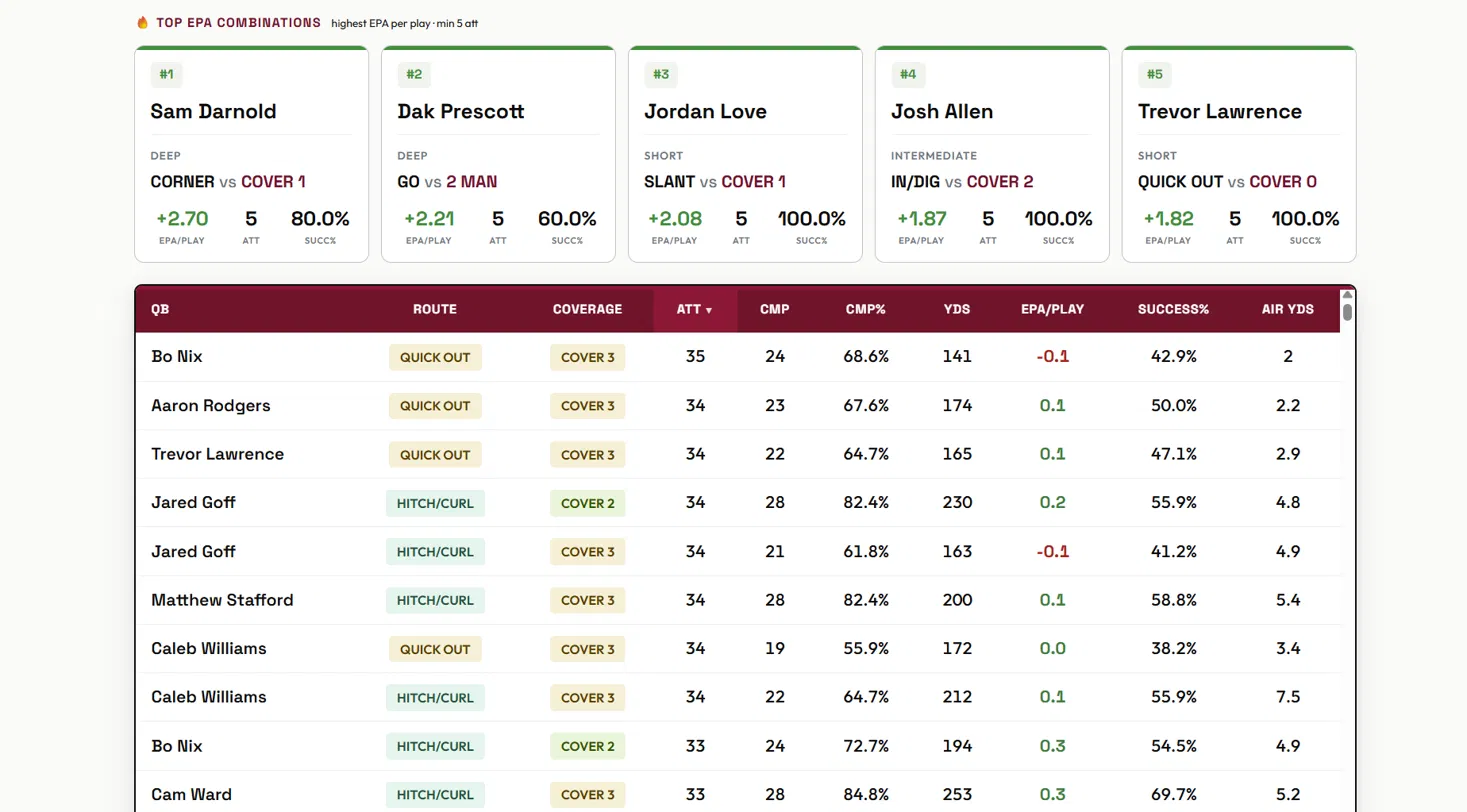
The reason this matters is that a quarterback is not one thing. He is a set of answers to a set of problems, and some of those answers are much better than others.
Jared Goff on hitch and curl routes is the cleanest illustration in the table. Against Cover 2: 34 attempts, 28 completions, 82.4%, 230 yards, positive EPA, 55.9% success rate. Against Cover 3, same route concept, same quarterback, essentially the same volume: 61.8% completions, 163 yards, negative EPA, 41.2% success rate.
Same throw. Same arm. The coverage changed and the results fell apart. That is not a story about talent, it is a story about what a defense can take away, and it is the kind of thing that is completely invisible in season totals.
Sorting matters here. Sort by attempts to see what an offense actually leans on, which tells you about scheme and playcalling. Sort by EPA to see what worked, which tells you about execution. The interesting cases are the combinations that appear at the top of one list and the bottom of the other: things a team calls constantly that are not producing.
One caution, and it applies to any leaderboard on any site. Small samples produce extreme numbers. A combination with five attempts can post a perfect success rate without meaning anything at all. The rows worth trusting are the ones with volume behind them, which is why sorting by attempts is a good first move.
What to go try: pick a quarterback and find his worst coverage. Then check whether the route concepts he struggles against are the ones his offense keeps calling anyway.
Redraft Rankings
The question it answers: where does the market disagree with the projection?
Rankings on their own are opinions, and there are a thousand of them. Rankings sitting next to ADP are useful, because the gap between where a player is projected and where he is being drafted is the only part of any of this you can actually act on.
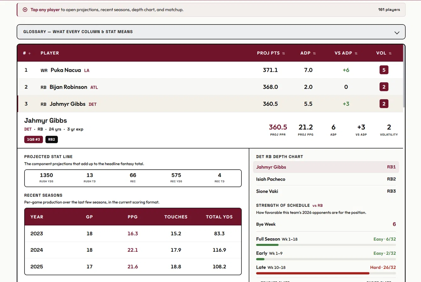
Every player carries a projected point total, current average draft position, and the difference between the two. A player projected third overall and drafted fifth is a spot where the board disagrees with the projection, and that is where value lives, in either direction.
The projections are mine and I would rather be honest about them than oversell them. They are a reasonable estimate, not a crystal ball, and their best use is comparative rather than absolute. The difference between two players is more trustworthy than either player’s exact number.
That is also why the expand panel exists. Tap any row and the projection comes apart into its components: rushing yards, rushing touchdowns, receptions, receiving yards, receiving touchdowns. If you disagree with a projection, you can see exactly which assumption is driving it, rather than being handed a total and asked to trust it.
The panel also carries the team’s depth chart and strength of schedule split into early season and late season. That split does more work than the full-season number. A back with an easy first nine weeks and a brutal close is a very different asset than the reverse, and a full-season SOS rating averages that distinction into nothing. If you are planning around a fantasy playoff run, the late-season number is the one that matters.
Volatility is the last column, and it is not a good-or-bad measure. It describes how wide the range of outcomes is. High volatility is a liability in a format where you need a steady weekly floor, and an asset in best ball, where only your good weeks count.
What to go try: sort by the difference between projection and ADP, then read the expand panel on the three biggest gaps in each direction. Half of them will be disagreements you side with the market on. The other half are your draft plan.
How the four fit together
Play Explorer and Player Lookup are for understanding what happened. Passing Combos is for finding patterns across the league. Redraft Rankings is for doing something with all of it.
They run on the same underlying data, so you can follow a thread across them. Find a route and coverage combination that a quarterback struggles with in Passing Combos, then open Play Explorer and read the actual plays. Notice a receiver’s route distribution in Player Lookup, then check whether his projection in Redraft Rankings reflects it.
That is the whole idea. Not a stat dump, but a set of tools that answer each other. Hope you enjoy!
Follow us on X: @OutsideZoneIO
